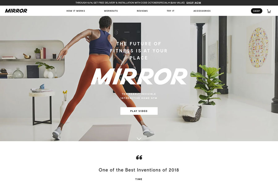
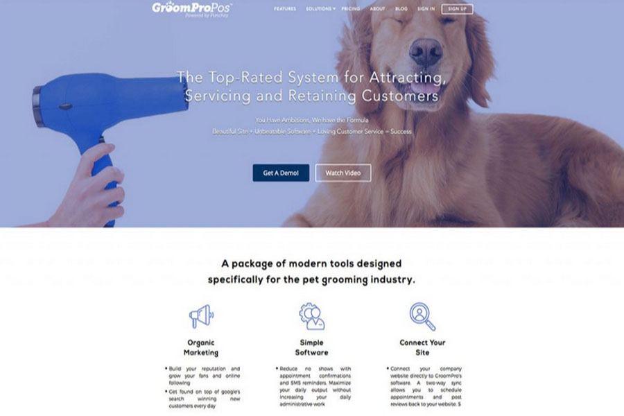
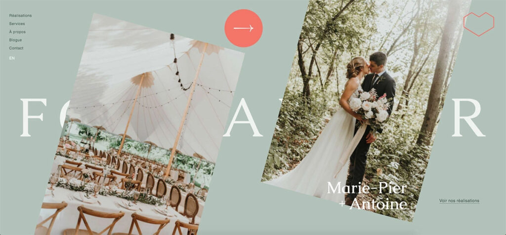
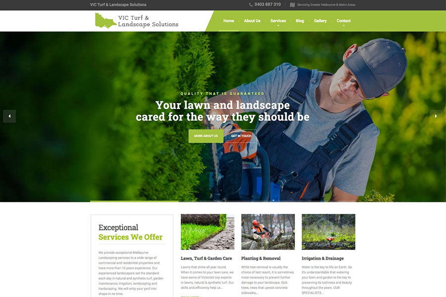
Minimalist design remains one of the most trusted approaches for building visually appealing, fast-loading, and user-friendly websites. Clean layouts, thoughtful spacing, and purposeful visuals help visitors focus on essential content without distractions. Whether you want a modern portfolio, a business website, or an eCommerce store, minimalist website examples offers clarity and professionalism.
This guide explores 20 of the best minimalist website examples for 2026, offering practical insights and actionable tips to elevate your own project. These examples blend simplicity with creativity, proving that minimal design can still feel vibrant and memorable.
Best Clean & Minimalist Website Examples
Minimalist websites reduce clutter and enhance readability. Visitors can navigate faster because each element has a clear purpose. Even when animations appear, they support the design rather than distract users. Modern brands, designers, and online stores embrace minimalism because it improves user engagement and keeps attention where it matters.
If you’re unsure which platform to choose, WordPress remains a top option for building minimalist websites. You can pair it with a sleek minimalist WordPress theme for a polished and scalable result.
1. Lars Tornoe
Built with: Squarespace
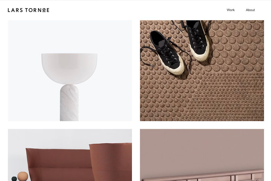
Lars Tornoe’s website uses a neat two-column grid design to present projects in a clean and organized layout. Each portfolio item features a subtle hover effect, leading to a dedicated project page with extra visuals and detailed descriptions.
The header includes a small logo and two navigation links, reinforcing the clean aesthetic. Interestingly, Lars Tornoe removes the footer on the homepage, leaving more open space for the portfolio grid. Only the project pages include a footer with additional links.
Tip: Remove the footer on some pages to create a more minimal and spacious design.
If you enjoy this layout, consider exploring modern Squarespace templates or curated portfolio website collections.
2. Monograph
Built with: Webflow
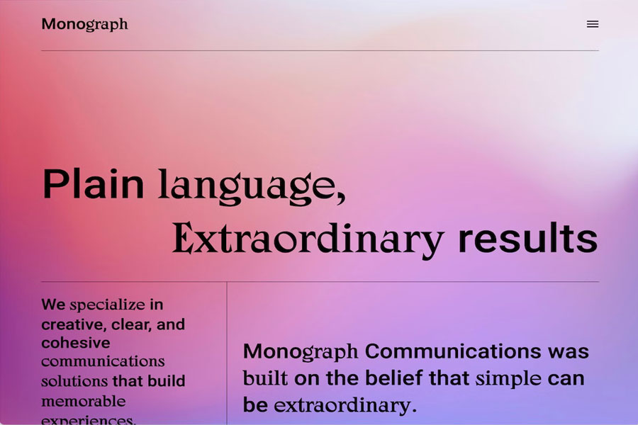
Monograph takes a bold approach with a text-first layout and a smooth gradient background. The header uses a hamburger menu icon, which slides out a left-side navigation panel when clicked.
A simple left sidebar displays a short sentence and a newsletter signup form, showing that minimalism doesn’t require heavy visuals. The footer contains a large Monograph logo above a simple list of menu links.
Tip: Larger font sizes and generous white space can produce a striking minimalist website design examples even without images.
If you need similar inspiration, browse through top Webflow website examples for alternative layouts.
3. Bedow
Built with: Gatsby
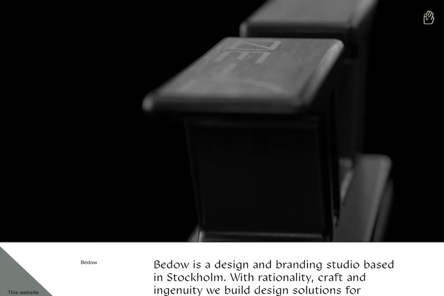
Bedow features a creative and minimalist website examples layout supported by a clickable hero video that instantly captures attention. The design remains clean, yet the homepage feels lively because of the bold visuals.
Instead of a standard hamburger icon, Bedow uses a waving hand symbol to open a full-screen navigation overlay. This adds personality without complicating the simple structure.
Tip: Use a high-quality hero video above the fold to engage users instantly.
4. ETQ
Built with: Shopify
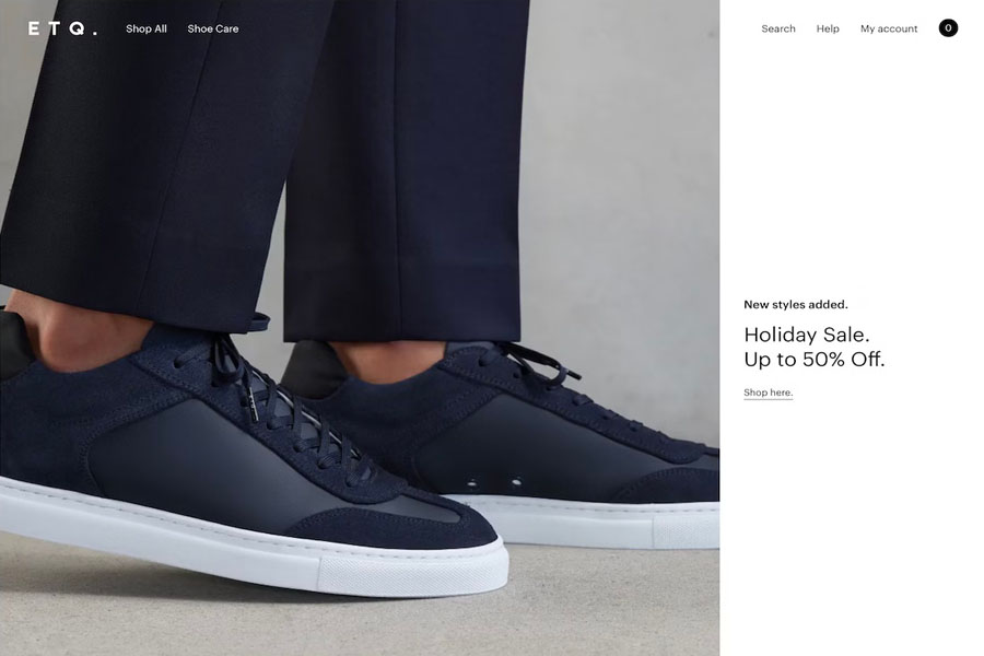
ETQ uses a balanced full-screen split layout, where two-thirds of the hero section is a sleek image and the remaining portion contains text and a link. The transparent header fades in and out as users scroll.
Although the footer includes multiple widgets, the light color palette maintains a clean and consistent look.
Tip: Transparent headers help create a smooth and lightweight appearance.
You may also want to explore other elegant shoe website designs for more ideas.
5. Netil Radio
Built with: Gatsby
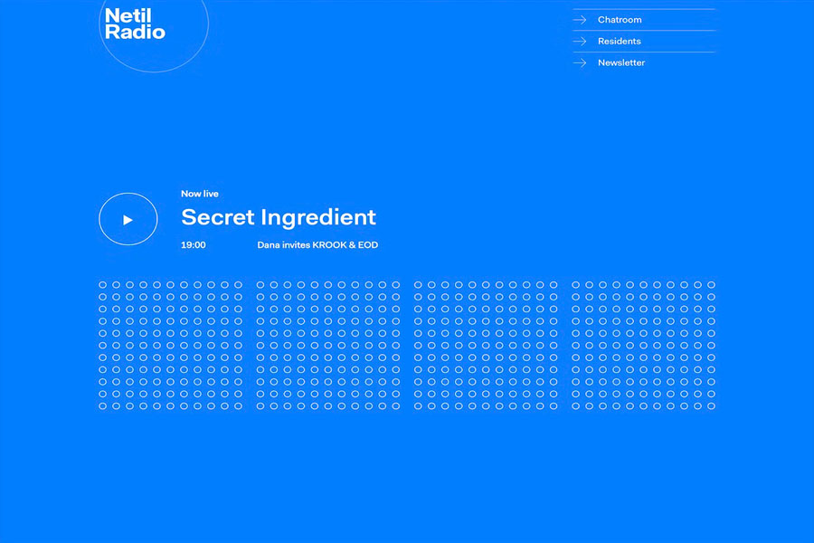
Netil Radio proves that minimalist website examples doesn’t require neutral colors. Its bright blue background stands out, yet the structure stays clean and simple. The hero section includes a large play button with a clear schedule description. When users press the button, outlined dots transform into solid elements.
The entire website lives on a single page, allowing users to browse everything with just a few scrolls.
Tip: A one-page layout pairs beautifully with minimalist design principles.
6. Field
Built with: Craft CMS
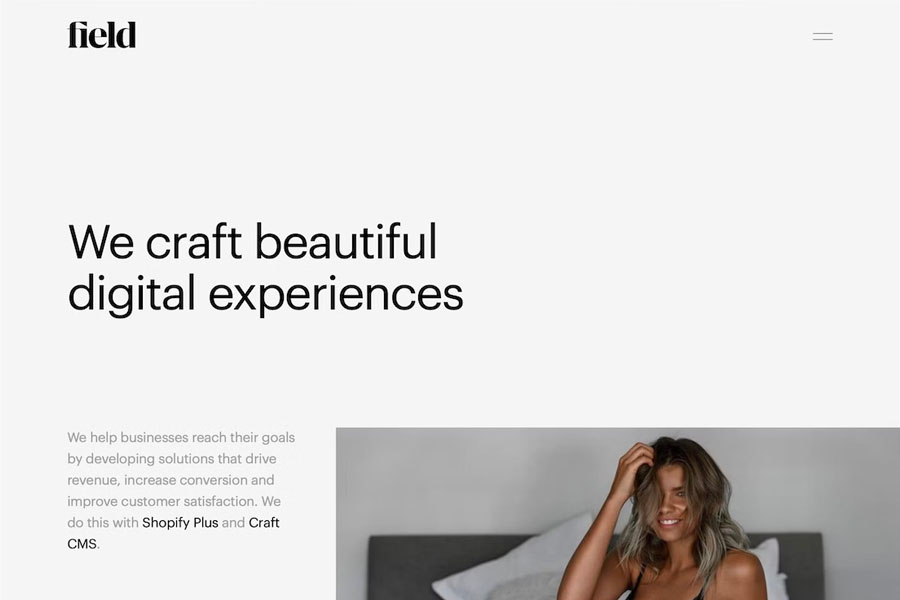
Field welcomes visitors with a full-screen preloading image, which includes a menu link and a skip option. This small detail makes the experience memorable without adding clutter.
The header hides during scrolling and reappears when the user moves back upward. Both the header and footer share the same background color as the main layout, creating a seamless design.
Tip: Use one consistent background color across your entire layout to achieve a unified minimalist look.
7. Scott Snyder
Built with: Squarespace
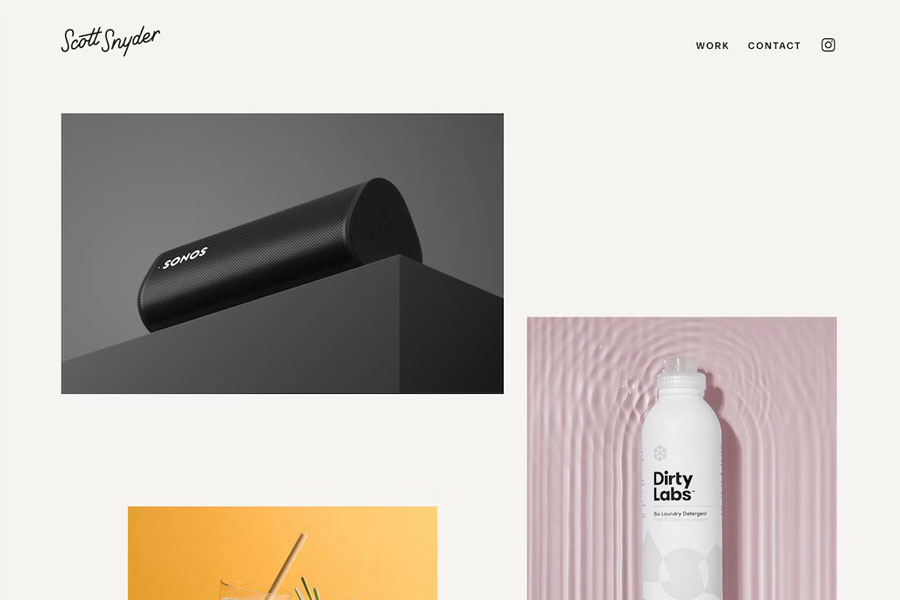
Scott Snyder presents his portfolio with an unconventional scattered layout. Each item links to an individual project page, echoing the approach used by Lars Tornoe. Some thumbnails include subtle animations, adding a dynamic touch.
Scott also showcases a list of clients and a testimonials section to strengthen credibility and social proof.
Tip: Incorporate testimonials or client reviews to enhance trust and support conversions.
Scott Snyder’s site uses a minimal Squarespace template, which you can also customize to build your own clean online presence.
8. Wendy Ju
Built with: Wix
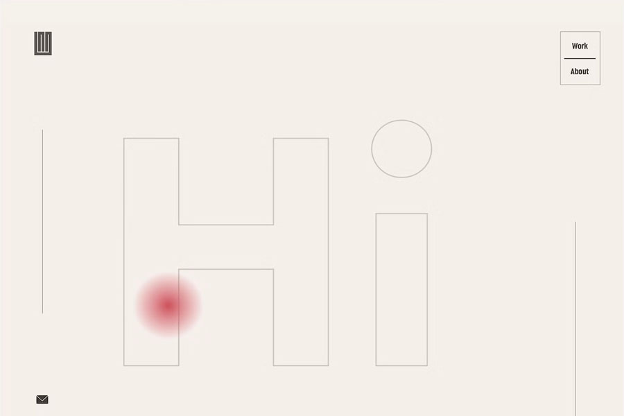
Wendy Ju creates a clean and engaging minimalist website design with a simple yet captivating hero text animation. This animated introduction adds personality without cluttering the screen. The website also features two sticky sidebars: social and email links on the left, and a minimal navigation panel on the right.
Her portfolio section includes eight projects, each represented by static or animated thumbnails. When visitors click a thumbnail, they land on detailed project pages with in-depth visuals and explanations.
Tip: Add animated hero text to make your layout more engaging, even if it displays simple greetings in multiple languages.
For additional inspiration, explore beautifully designed websites built with the Wix platform.
9. Casa Mami
Built with: Squarespace
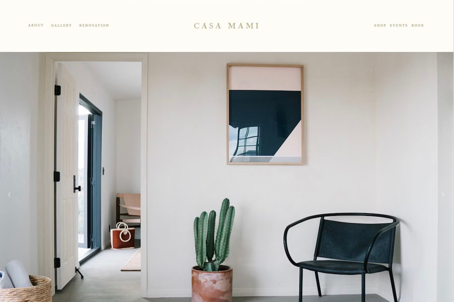
Casa Mami welcomes visitors with a warm and calming image slider. The slideshow contains no call-to-action buttons or clickable elements. Its sole purpose is to create a peaceful introduction to the website. This approach supports the brand’s focus on simplicity.
Further down the page, Casa Mami uses a parallax image effect paired with a subtle CTA button. The button turns solid on hover, adding an elegant interactive touch.
Tip: Use a parallax background to add depth and dimension to your minimalist website.
10. Anthony Wiktor
Built with: Gatsby
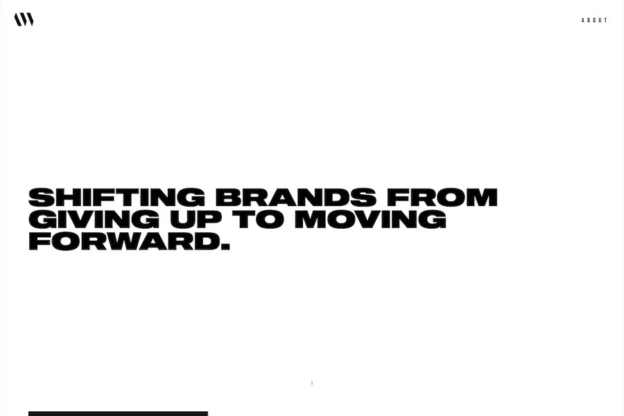
Anthony Wiktor’s personal blog website begins with a bright layout that transforms into a dark theme as visitors scroll. This smooth transition keeps the design fresh while maintaining a minimalist foundation.
The portfolio section includes a unique hover effect. Each hover changes the thumbnail and gently dims the rest of the layout with shifting shades. This technique highlights the content while preserving visual balance.
Tip: Mix light and dark themes to add visual interest without breaking your minimalist tone.
11. Gary Le Masson
Built with: Drupal
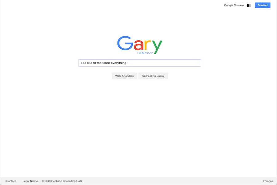
Gary Le Masson takes a bold approach by designing his website as a playful Google-inspired interface. It showcases his resume, contact information, and featured details in a familiar yet creative format.
This unconventional layout expands the possibilities of minimalist design. It shows that simple doesn’t need to be predictable. With thoughtful creativity, a minimalist site can stand out instantly.
Tip: If you lack ideas, reinvent a recognizable platform and give it your creative twist.
12. Mintboxx
Built with: Weebly
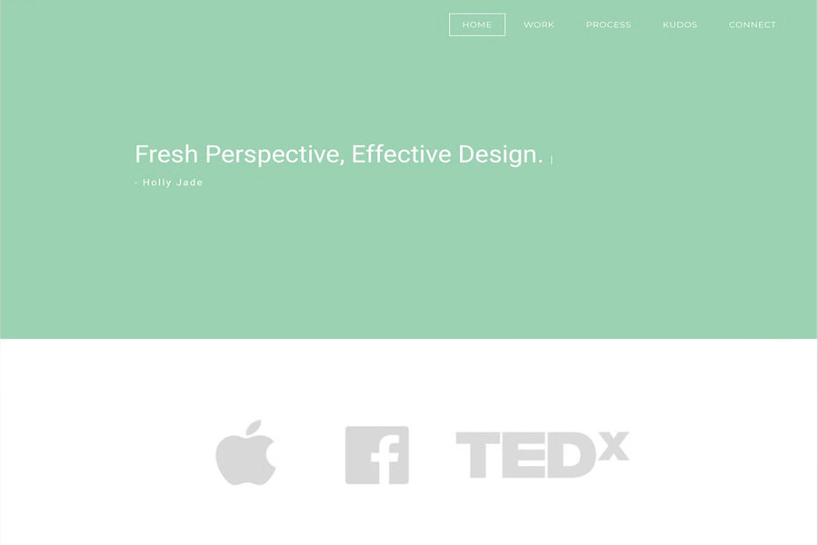
Mintboxx delivers an ultra-clean layout with plenty of white space, minimal text, and very few images. Despite its simplicity, the browsing experience remains enjoyable across all devices due to the careful spacing and clarity.
The one dynamic element on the homepage is a typewriter-style animation that adds a subtle creative touch to the hero section. It enhances the design without overpowering the minimal layout.
Tip: Use a typewriter or sliding text effect to elevate simple hero sections.
You can also explore more stunning examples in our curated list of Weebly website designs.
13. Andrew McCarthy
Built with: GitHub Pages
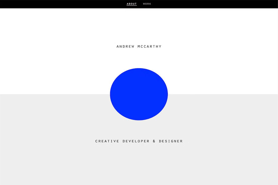
Andrew McCarthy embraces a clever and unconventional minimalist website examples design element: an infinite-scroll loop. The layout displays rotating overlaid objects, creating a visual trick that may take time to notice. This unexpected twist adds character to an otherwise minimalist design.
Because the looping effect can immerse visitors for longer than expected, Andrew ensures the menu becomes visible when scrolling back upward. This feature helps users navigate without frustration.
14. And Then Jupiter
Built with: Craft CMS
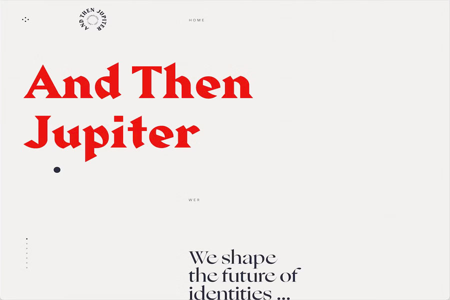
And Then Jupiter is a minimalist website design that relies heavily on strong typography. Similar to Mintboxx, it uses a dynamic text effect in the hero section to grab attention immediately.
The layout blends large and small text with generous white space. This balance creates an enjoyable reading flow and keeps the design clean. The floating header includes a unique menu icon that opens a full-screen overlay filled with subtle animations.
Tip: Use large fonts and bold or uppercase text for better readability and faster skimming.
Not sure about animations? Explore a curated selection of animated websites for extra ideas.
15. OrangeYouGlad
Built with: Wix
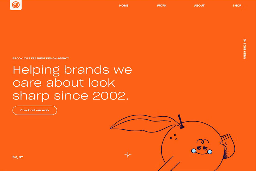
OrangeYouGlad maintains a minimalist structure while adding fun, creative, and animated elements. These details enhance user engagement without overcrowding the design.
One standout feature is the playful hover effect on the “drop us a line” button. When hovered, the “howdy” text shakes in a charming, word-by-word motion. It’s a small feature, yet it adds personality.
Tip: Minimalist layouts don’t need to stay overly serious. Use tasteful animations to increase the cool factor.
16. Beginner Bank
Built with: Webflow
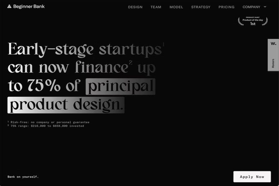
Beginner Bank uses a bold dark minimalist website design that creates a premium aesthetic. The layout becomes lighter only in the final section. This shift helps maintain user interest while preserving the minimal theme.
As a single-page website, it includes several sticky elements: a sticky header, a sticky message in the bottom left corner, and a sticky CTA in the bottom right. These components ensure visitors always have access to key actions.
Tip: Build a one-page business site to improve the user experience and keep navigation simple.
17. Scope Copenhagen
Built with: Elementor
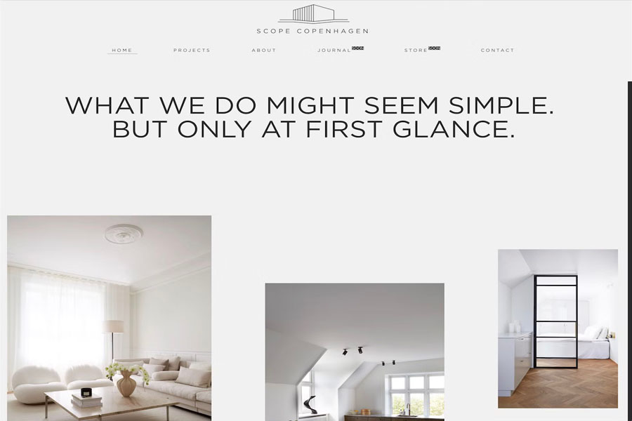
Scope Copenhagen reflects classic Danish minimalism with simplicity and purpose. Below the clean header sits a short, strong introduction followed by stunning project images. Visitors can explore individual works or access more details through the floating navigation bar.
The footer uses four columns for menus, social links, and project categories. It also includes a day/night mode switcher for personalized browsing.
Tip: Add a light and dark mode toggle to give users control over their viewing preference.
If you prefer WordPress and page builders, check out a full Elementor review before choosing your tools.
18. Maciej Bączkowski
Built with: Kirby
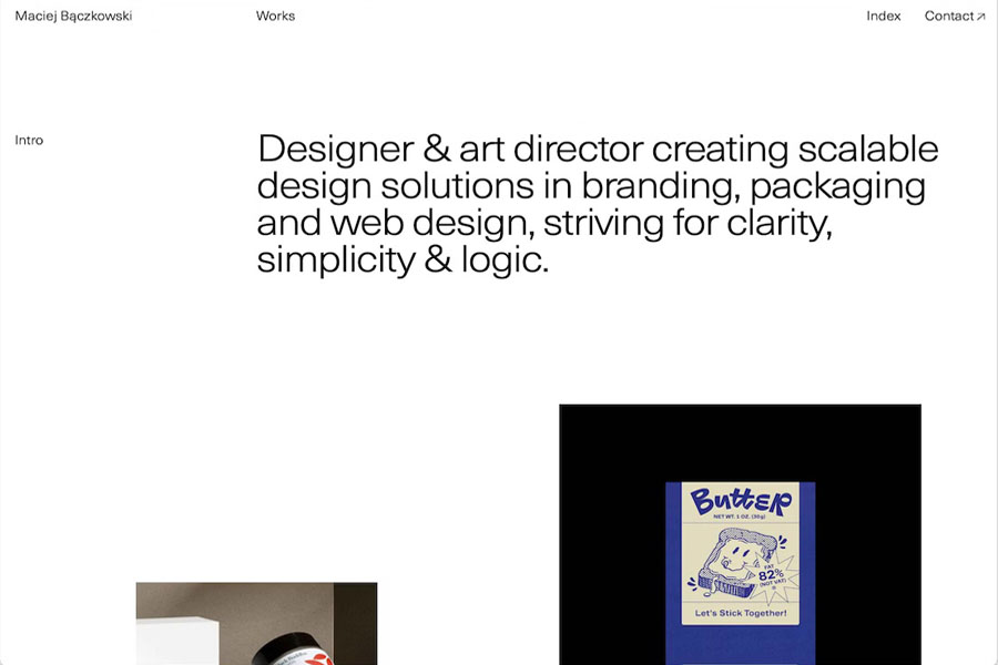
Maciej Bączkowski’s website is another excellent example of a text-only hero area. The minimalist layout displays a spaced-out portfolio that loads content as visitors scroll.
The floating header contains only links, avoiding background elements to reduce distraction. His footer reveal effect adds a subtle touch not often seen in simple layouts.
Tip: Use a footer reveal animation to introduce smooth motion without overwhelming the design.
19. Shanley Cox
Built with: Squarespace
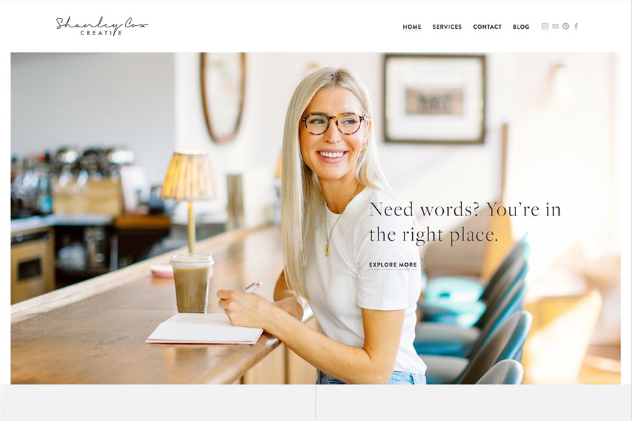
Shanley Cox is an expert copywriter with decades of experience producing high-quality content. Her minimalist website helps build trust through clean structure, clear messaging, and professional presentation.
She highlights her social presence because many leads come from those channels. Shanley is also a photographer, which enhances her brand across platforms. Her website supports the full story rather than telling all of it, encouraging deeper engagement.
Tip: Combine strong images with white space to increase credibility and visual appeal.
20. Matt D’Avella
Built with: Squarespace
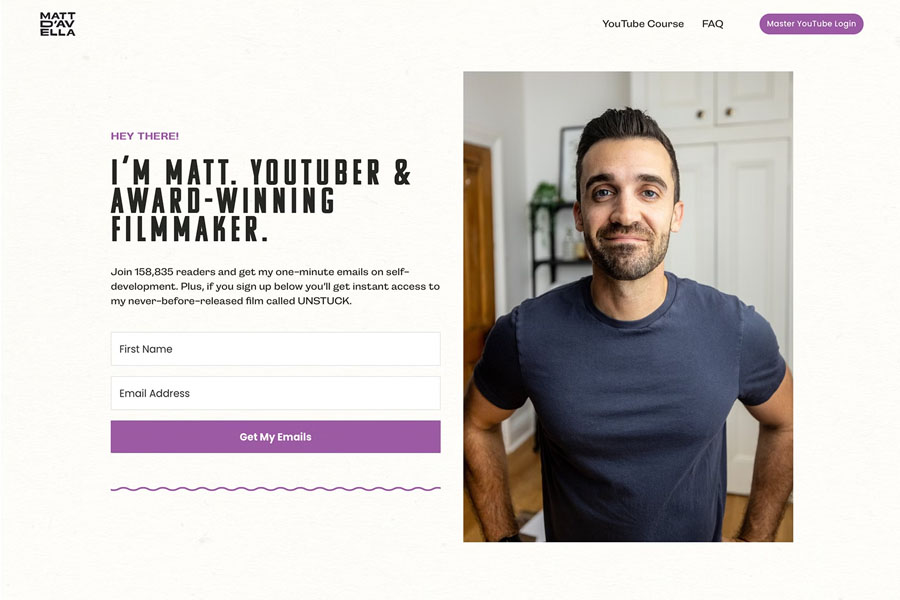
Matt D’Avella is a filmmaker and popular YouTuber with millions of followers. Known for his storytelling, he uses a minimal Squarespace website for email signups, course access, and simple product promotion.
His site stays extremely clean, offering only what visitors need. The minimal structure aligns with his personal brand and helps convert fans into course members.

