16 Best Accessible WordPress Themes 2026
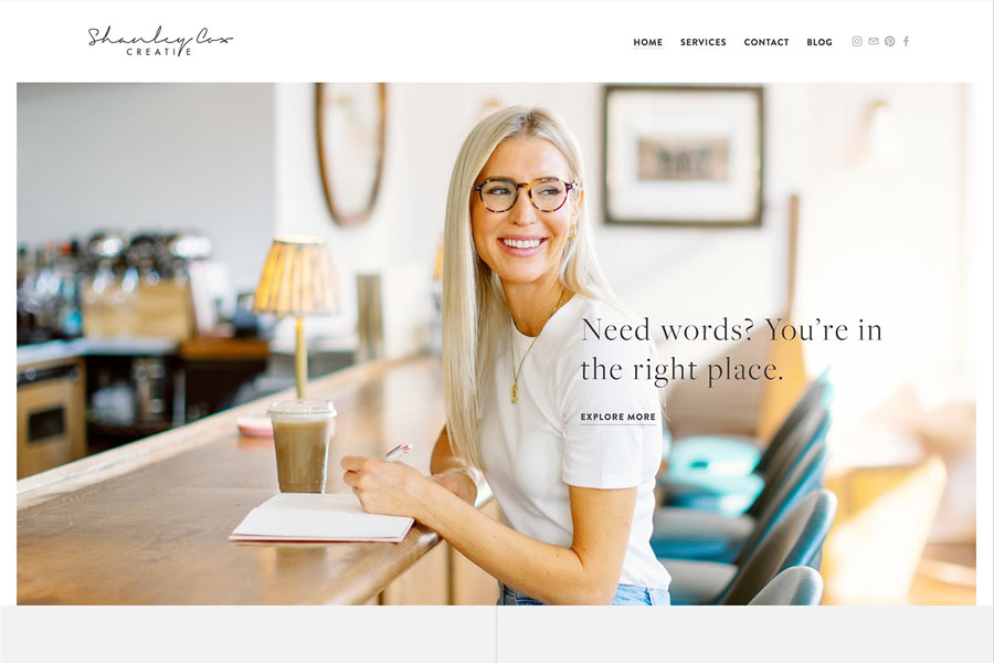
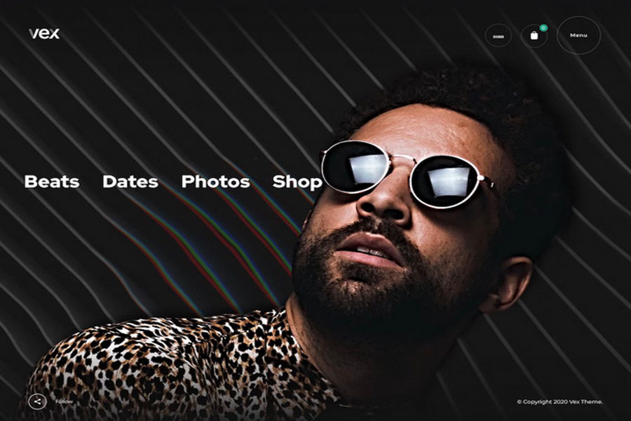
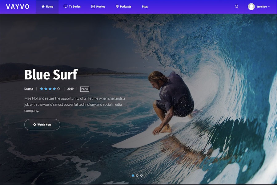
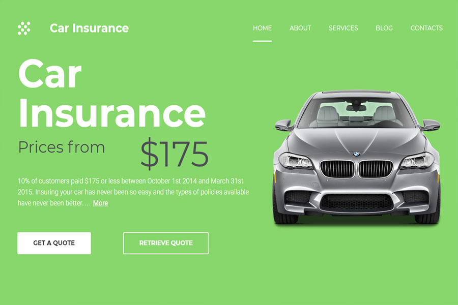
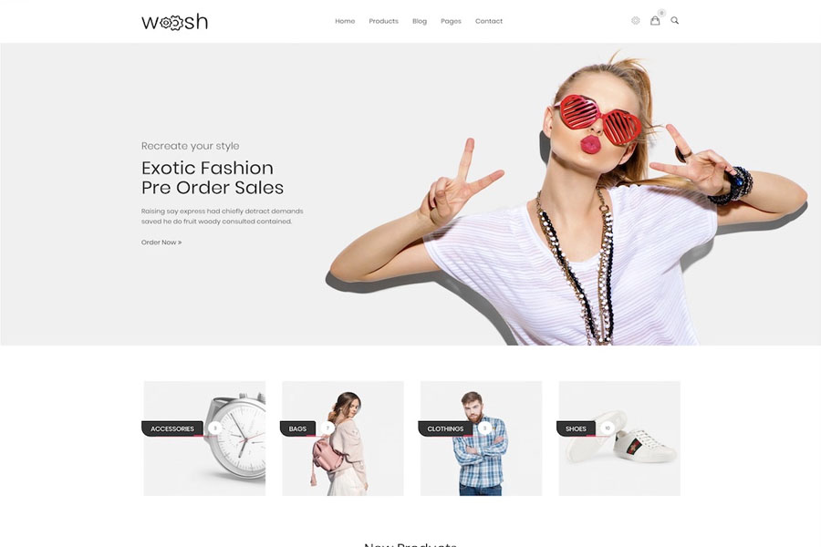
Creating a website that welcomes every visitor is no longer optional — it’s essential. Inclusive design boosts engagement, improves usability, and aligns your brand with global web accessibility standards like WCAG and ADA. If you want your site to be more usable for everyone, accessible WordPress themes provide the perfect starting point. Instead of building a layout from scratch, you can rely on expertly crafted designs built with performance, readability, and accessibility in mind. These themes eliminate barriers, enhance usability, and simplify your workflow. You can launch a polished and compliant site without advanced technical skills. This guide highlights the best accessible WordPress themes. Each option is built to support ADA standards, follow accessibility guidelines, and improve user experience across all devices. Whether you’re starting a government site, an online store, a portfolio, or a medical platform, these themes help you build stronger websites with less effort. Start strong — finish stronger. Explore the top-performing and most reliable accessibility-ready themes below. Best-Performing Accessible WordPress Themes 1. Polyclinic – Best Accessible Theme for Medical Websites Polyclinic stands among the top accessible WordPress themes for medical and healthcare platforms. Designed for hospital websites, clinics, and private practices, it follows and exceeds WordPress accessibility guidelines. It includes a consistent heading structure, ARIA landmark roles, and descriptive “read more” links for improved navigation. The theme supports keyboard-friendly navigation for desktop and mobile users, along with helpful skip links. Polyclinic also meets the AA color contrast ratio to ensure excellent readability. Since it integrates with Beaver Builder, you can create custom pages quickly. The process is simple, intuitive, and perfect for busy medical teams that want to maintain a polished digital presence. 2. Icelander – Fully Compliant and Flexible for Business Sites Icelander is ideal for business portfolios, corporate sites, and eCommerce websites that must meet strict accessibility standards. It is coded for reliability and performance, making it one of the most trusted accessible WordPress themes. The theme meets WCAG 2.0 Level AA and Section 508 requirements. It also features a responsive, mobile-first layout that looks great on every device. Icelander includes user-friendly drag-and-drop page building. You can edit colors, typography, and layout settings and preview changes live. This feature reduces development time and helps you create professional results without stress. 3. Monument Valley – Clean, Modern, and SEO-Focused Monument Valley offers a clean and attractive design suitable for eCommerce shops, business themes, and creative portfolios. It follows WordPress accessibility standards, which also help improve SEO and site visibility. This theme works with Beaver Builder, but it also supports Elementor, WPBakery, and other popular page builders. Monument Valley gives you three homepage styles: elegant, portfolio, and shop. You can install any version with one click. Built with speed in mind, this theme ensures faster loading times and improved performance — both essential for modern users and search engine rankings. 4. Cindy – Best Accessible Theme for Government and Community Sites Cindy is designed for local government projects, municipalities, and community-focused websites. With its prebuilt layouts and simple setup process, you can launch a professional site in minutes. Although it works well out of the box, you can customize every section to match your brand or project needs. Cindy also supports translation plugins like Loco Translate, allowing you to deliver content in any language. Cindy makes public information accessible, navigable, and easy to understand — a must for modern government websites. 5. Angelica – Accessibility-Ready Theme for Bookstores and Shops Angelica provides every tool you need to launch an online bookstore quickly. It is optimized for accessibility and performance, making it perfect for authors, publishers, libraries, or online shops. This theme supports drag-and-drop builders, includes a mega menu, and offers a clean blog section. Since it follows modern SEO practices and current design standards, your website will load fast and offer a better user experience. Angelica’s user-friendly layout ensures a seamless shopping journey, helping you convert more visitors into customers. 6. Björk – Stylish Accessible Portfolio Theme Björk gives creatives a modern way to showcase their work through an inclusive and accessible layout. It includes multiple index pages and internal templates designed with clarity and structure in mind. Although it works well without modifications, you can still customize everything to match your style. Björk’s structure supports strong visual storytelling and helps you increase your online presence. With one-click demo import, you can start building your site in minutes. Björk ensures your portfolio stands out while remaining accessible to all viewers. 7. Muse – Accessible Music Theme With Creative Flexibility Muse offers excellent flexibility for musicians and creative professionals who want an accessibility-ready website. It includes seven ready-made demos that you can import with one click. With its large set of design elements, Muse helps you build a unique and modern music wordpress theme fast. The theme improves readability for blind users and works with voice readers. WooCommerce support allows you to sell music, merchandise, or digital products directly from your site. Muse gives artists a simple and inclusive way to grow their presence online. 8. Salmon – Restaurant Theme Prioritizing Accessible Navigation Salmon is perfect for restaurant theme, pubs, pizzerias, bars, and food shops that need accessible layouts. It includes six demos, offers full customization, and works smoothly on mobile devices. You can use drag-and-drop tools to build pages without coding. Its clear call-to-actions, strong color contrast, and readable design ensure that every visitor enjoys a smooth browsing experience. Salmon helps you deliver inclusive navigation across all screens. 9. Crocal – Creative and Accessible Multipurpose Theme Crocal is one of the most versatile accessible WordPress themes available today. You can build almost any website, including portfolios, shops, wedding sites, architecture pages, sports pages, or agency sites. It includes numerous demos that work instantly after installation. Crocal features a smart grid system, WPBakery support, mobile optimization, and fast loading speeds. Slider Revolution is included as well. You can also view video tutorials to learn the basics. Crocal makes website creation smooth and stress-free. 10. Draven –
16 Best Accessible WordPress Themes 2026 Read More »